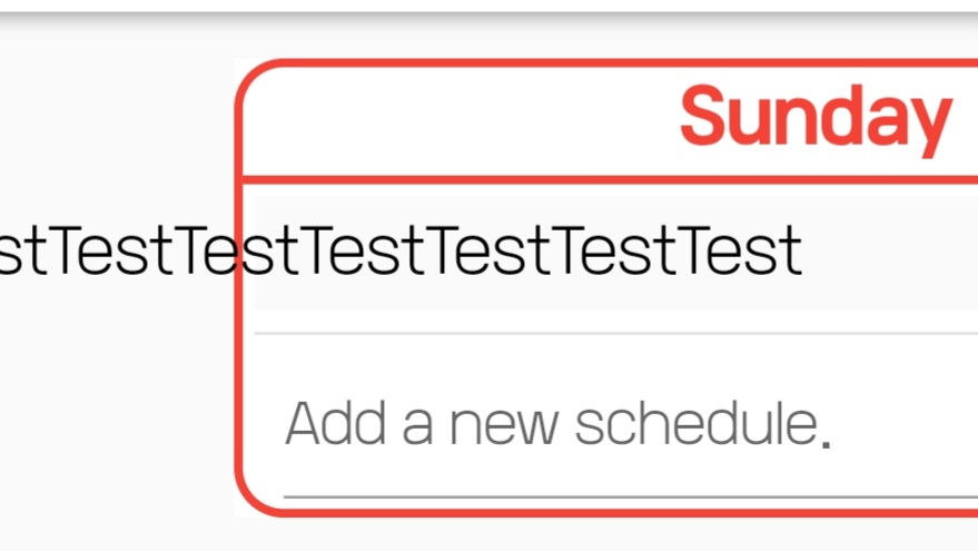
 before before |
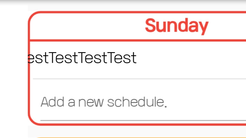 after after |
왼쪽 사진처럼 할 일 목록을 삭제할 때마다 글씨가 튀어나가는게 조금 거슬렸었다.
그래서 그냥 저 빨간 테두리 Sunday 위젯 좌우로 흰색 Container를 세워서 글씨 튀어나가는 것을 가려봤다.
위젯을 겹쳐서 놓기 위해 원래 있던 위젯을 Stack 위젯으로 감싸줬고, 그 안에 저 요일 위젯들, 그리고 새로 추가한 Container 두 개를 각각 Positioned로 감싸서 왼쪽 오른쪽에 배치해줬다.
Before
Column(
    children: List.generate(
    7,
    (index) {
        return Container(
        padding: const EdgeInsets.all(8.0),
        child: day(whatDay: index),
        );
    },
    ),
),
After
Stack(
    alignment: Alignment.center,
    children: [
    Column(
        children: List.generate(
        7,
        (index) {
            return Container(
            padding: const EdgeInsets.all(8.0),
            child: day(whatDay: index),
            );
        },
        ),
    ),
    Positioned(
        left: 0,
        child: Container(
        color: Colors.white,
        height: 10000,
        width:
            (MediaQuery.of(context).size.width - 400) /
                2,
        ),
    ),
    Positioned(
        right: 0,
        child: Container(
        color: Colors.white,
        height: 10000,
        width:
            (MediaQuery.of(context).size.width - 400) /
                2,
        ),
    ),
    ],
)
Positioned 위젯 width에 저런 식이 나온 이유를 간단하게 설명하자면
MediaQuery.of(context).size.width = 스크린 사이즈(가로)
400 = 요일 위젯 가로 길이
총 스크린 너비에서 요일 위젯 너비를 뺀 길이, 즉 빈 여백 공간의 너비를 구한 후, 그것을 2로 나눠 좌우에 각각 배치해준 것이다.
버전 1.0.2 => 1.0.3
다운로드
웹버전 링크 :
planner.jcy1511.com안드로이드 설치 파일 :
WPlanner.apk